Global Pig Slaughter Statistics and Charts


This post is part of the exclusive Faunalytics series about global animal slaughter. Go here for an overview of the topic and trends by species. For similar statistics and charts for other species, see our posts for cows, chickens, sheep, and goats.
In this post we focus on pigs killed for food. First we consider pigs slaughtered in the year 2016 and then we’ll look at trends over time (1961-2016). As noted in the overview, pigs are the second most common animal killed for food (after chickens, but excluding fish). In total, nearly 1.5 billion pigs were slaughtered for food in 2016 according to United Nations data. For animal advocates, we think it may be helpful to examine the geographic distribution of these slaughtered pigs.
To get an idea of the current situation, below we provide an interactive global map of pig slaughter data from 2016, by country. Note that the legend shown is logarithmic to help with interpretation because the differences between countries is substantial. We also provide a table with the ten countries that slaughtered the most pigs in 2016.
Note that pig slaughter data for many Middle Eastern countries are missing. A possible reason is that these are predominantly Islamic countries and many Muslims do not eat pork.
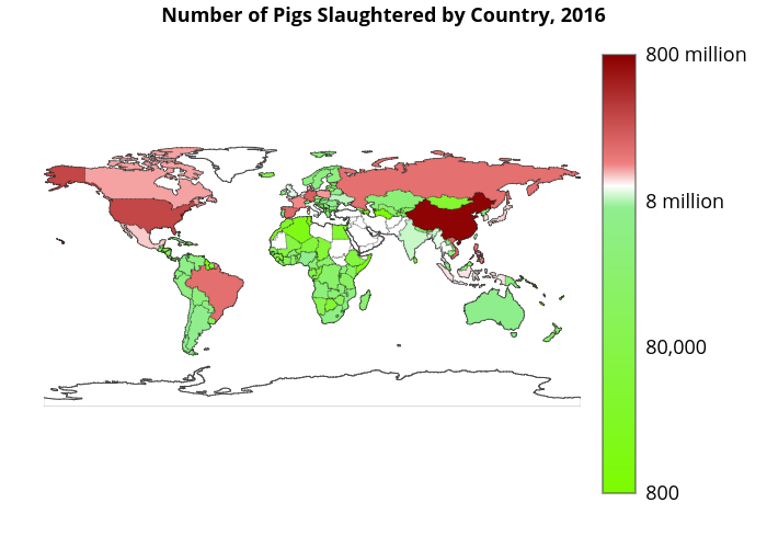
From the table, we can immediately see that China kills the most pigs for food, by far. In 2016, almost half (48%) of pigs were slaughtered in China. This might be due to the fact that pork is a major element in Chinese cuisine; of course, China’s large population is also a factor. It might be interesting to see whether China also has high per capita pig slaughter. To examine this by controlling for population size, we show the same interactive world map but now with per capita values.
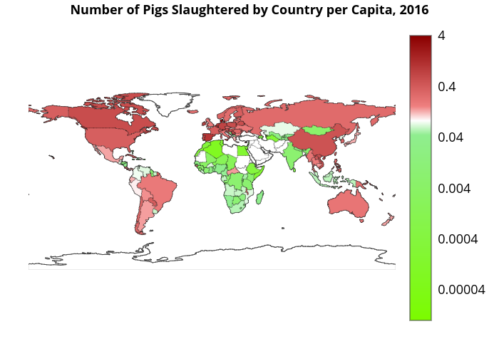
Surprisingly, China is not even in the top ten when it comes to per capita pig consumption! An average of 0.50 slaughtered pigs per Chinese resident puts the country just outside of the top ten list. Denmark, which slaughters the most pigs per capita, slaughters more than six times the number of pigs as China when calculated on a per capita basis. Spain is the only country that appears in both top ten lists and could be an interesting country for advocates to target.
Below are stacked area graphs for both the total and the per capita pig slaughter numbers. In addition to using these charts to test our “cultural hypothesis,” we can also see the trends over time. Note that we implicitly assume that people from the same continent are somehow culturally “similar” and therefore exhibit similar slaughter behaviour.
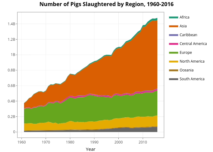
As the chart shows, the total number of pigs killed has increased in the period from 1961 to 2016, for all geographic regions. In 2016, Asia slaughtered the most pigs, followed by Europe and North America. In 1961, Asia’s total pig slaughter number was smaller than that of Europe and North America, but Asia has since grown to eclipse all other regions. How much of this large increase was due to population growth? We can look at that by considering the per capita stacked area graph.
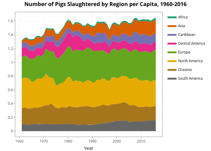
Per the chart above, we see that the number of pigs killed per capita in Asia has increased slightly as well, suggesting that the growth in pig slaughter is due both to consumer preferences for pork as well as as population growth. However, per capita pig slaughter in 2016 was highest in Europe, followed by North America, Oceania, Asia, and South America.
The number of pigs slaughtered per capita seems to be relatively stable in Europe, North America and Oceania. Since 1961, it seems to have slightly increased in Africa, Asia and South America. In addition to the stacked area graphs, below we also include a table with the Compound Annual Growth Rate (CAGR) for each region. This is a quick way to compare the trends between the continents. The CAGR is calculated as follows:
$$\text{CAGR} = \left(\frac{\text{Ending Value}}{\text{Beginning value}}\right)^\left(\frac{1}{\text{# of years}}\right) – 1.$$
Performing this calculation for each region results in the following table: