
Global Cow Slaughter Statistics and Charts


This post is part of the exclusive Faunalytics series about global animal slaughter. Go here for an overview of the topic and trends by species. For similar statistics and charts for other species, see our posts for chickens, pigs, sheep, and goats.
In this post we focus on cows killed for food. First we consider cows slaughtered in the year 2016 and then we’ll look at trends over time (1961-2016). In total, more than 300 million cows were slaughtered for food in 2016 according to United Nations data.
To get an idea of the current situation, below we provide an interactive global map of cow slaughter data from 2016, by country. Note that the legend shown is logarithmic to help with interpretation because the differences between countries is substantial. We also provide a table with the ten countries that slaughtered the most cows in 2016.
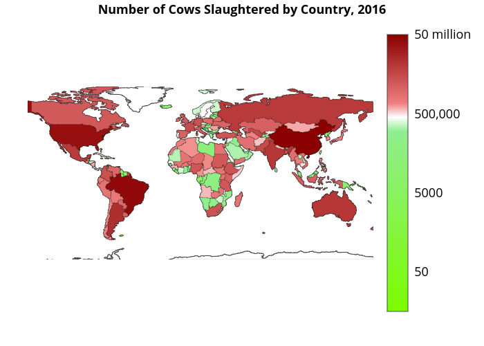
It is not surprising that countries killing large numbers of cows also have large populations. There is a clear top three: China leads, followed by Brazil and then the United States. It is interesting to examine if these ten countries also are in the top ten if we control for population size. Below we show the same graph and table, but now per capita. Note that the legend of the world map is again logarithmic.
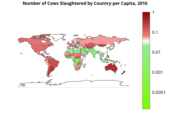
From the list of top ten countries in absolute numbers, only New Zealand, Australia and Brazil are in the top list when we look at per capita numbers. When it comes to advocating for cows, specifically, these countries that appear on both lists might be good focal points. .
By far, New Zealand slaughtered the most cows per capita. In 2016, more than one cow was slaughtered for every New Zealand resident. In comparison, China, which slaughtered almost 50 million cows in 2016, slaughtered a relatively small 0.034 cows per person.
Because the differences between the countries are large, both in absolute numbers and per capita, it might be insightful to group the countries together by continent using a stacked area graph. Another advantage of using this graph is that one can easily examine the trends over time. Note that these charts implicitly assume that people from the same continent are similar, obscuring the differences between countries.
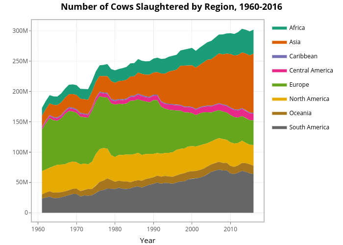
The chart shows that, over the period from 1961 to 2016, the total number of cows slaughtered has increased in Africa, Asia, Central America, Oceania, and South America. It has decreased in Europe and North America. It is striking that in the “Western world” the numbers have been decreasing over time. To account for population size, we again consider the per capita graph.
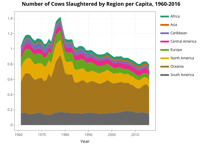
This chart indicates that the number of cows slaughtered per capita increased in Asia and Central America and decreased in Africa, Europe, North America, Oceania, and Southern America. It seems likely that the total increase in the number of cows slaughtered in Africa and Oceania has been due to population growth.
For completeness, below we have also included a table with the Compound Annual Growth Rate (CAGR) for each region. This is a quick way to compare the trends between regions. The CAGR is calculated as follows:
$$\text{CAGR} = \left(\frac{\text{Ending Value}}{\text{Beginning value}}\right)^\left(\frac{1}{\text{# of years}}\right) – 1.$$
Performing this calculation for each region results in the following table: