Global Sheep Slaughter Statistics and Charts


This post is part of the exclusive Faunalytics series about global animal slaughter. Go here for an overview of the topic and trends by species. For similar statistics and charts for other species, see our posts for cows, chickens, pigs, and goats.
In this post we focus on sheep killed for food. First we consider sheep slaughtered in the year 2016 and then we’ll look at trends over time (1961-2016). As noted in the overview, sheep are the third most common animal killed for food (after chickens and pigs, but excluding fish). In total, more than 550 million sheep were slaughtered for food in 2016 according to United Nations data. For animal advocates, we think it may be helpful to examine the geographic distribution of these slaughtered sheep.
To get an idea of the current situation, below we provide an interactive global map of sheep slaughter data from 2016, by country. Note that the legend shown is logarithmic to help with interpretation because the differences between countries is substantial. We also provide a table with the ten countries that slaughtered the most sheep in 2016.

Similarly to other types of farmed animals, the number of sheep slaughtered is highest in China, representing 26.2% of the total slaughter number worldwide in 2016. It is interesting to note that the United States, which is among the top ten countries for other animals, does not appear in the top ten list for sleep slaughter.
Below we show the same graph and table controlled for the population size of all countries.
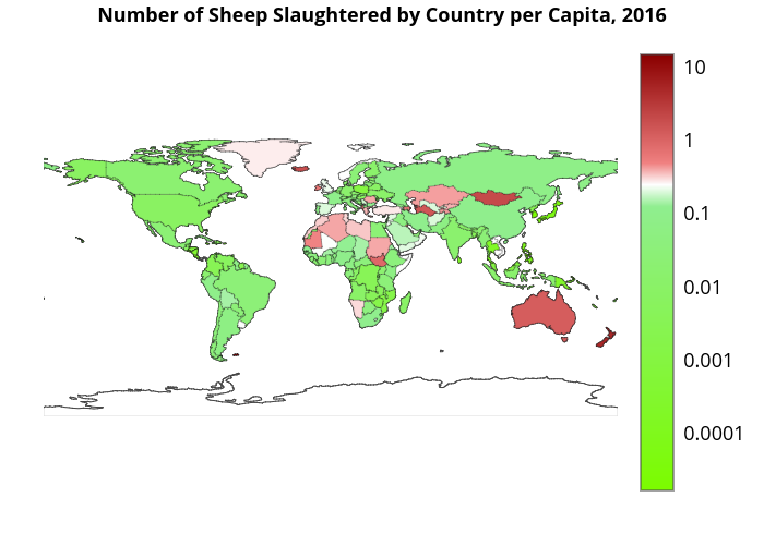
Sitting alone at the top of the per capita list are the Falkland Islands, which slaughtered an astonishing 14 sheep per person in 2016. However, the most interesting countries for sheep advocates may be New Zealand and Australia, as these countries slaughter a large number of sheep in both absolute and per capita terms (though much of this is for export purposes).
Below are stacked area graphs for both the total and the per capita sheep slaughter numbers. Note that we implicitly assume that people from the same continent are somehow culturally “similar” and therefore exhibit similar slaughter behaviour.
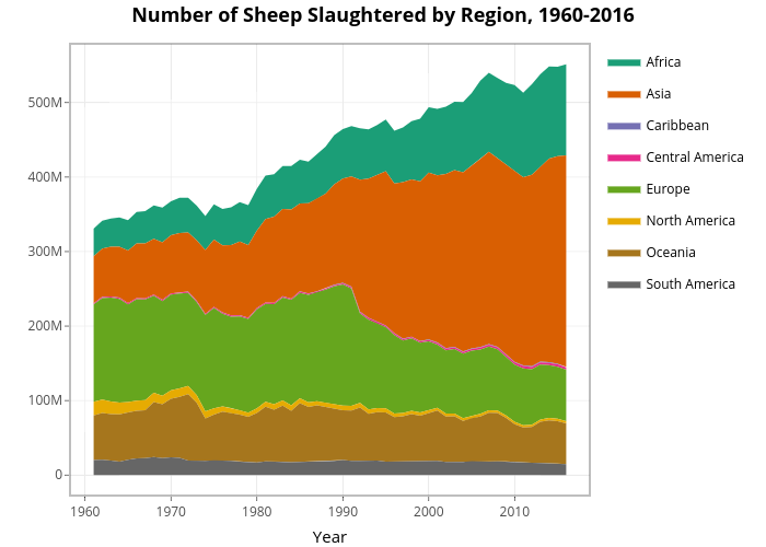
Based on the chart above, we can see that 1961 Europe slaughtered the most sheep in 1961, but has since been overtaken by Asia and Africa. Over time, the slaughter number has increased substantially in Asia, and to a lesser extent Africa. It has decreased in Europe, North America, and South America. It is interesting to examine these trends while controlling for population size.
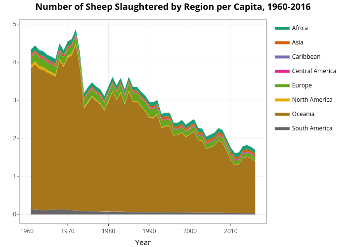
This is a clear picture. Countries in the Oceania region slaughter, by far, the most sheep on a per capita. While the per capita slaughter figures for Oceania have decreased quite substantially, from 3.7 sheep per person in 1961 to 1.4 in 2016, the region remains the primary sheep killer. Again, note that many of these sheep are exported for consumption in other countries. Per capita sheep slaughter decreased in Africa, Europe, North America, and South America, but increased in Asia.
In addition to the stacked area graphs, below we also include a table with the Compound Annual Growth Rate (CAGR) for each region. This is a quick way to compare the trends between the continents. The CAGR is calculated as follows:
$$\text{CAGR} = \left(\frac{\text{Ending Value}}{\text{Beginning value}}\right)^\left(\frac{1}{\text{# of years}}\right) – 1.$$
Performing this calculation for each region results in the following table: