Global Animal Slaughter Statistics & Charts


Latest Update: April 2026
Next Scheduled Update: April 2027
Welcome to the Faunalytics Global Animal Slaughter Statistics & Charts hub.
In this comprehensive resource, we look at the number of animals slaughtered globally for food every year, based on data gathered by the United Nations Food and Agriculture Organization (FAO).
Source
The data for land animals comes from the FAOSTAT database, obtained using the following filters: “Producing Animals/Slaughtered” in “Elements” and by selecting the relevant animals in “Livestock primary > (List)” under “Items.”
The data for fishes was pulled from the FishStatJ database, the software for fisheries and aquaculture from the FAO. You can retrieve the data from “Global Production By Production Source 1950-2024,” the most recent dataset, using the following filters: “Fish and other fishing products” under “CPC Division” and both “Aquaculture production” and “Capture production” under “Production Source.” The FAOSTAT database counts land animals by the individual animal slaughtered, but this is not the case for fishes, who are measured in live weight (units are either tons or kilograms).
The human population data used to calculate per capita numbers comes from the UN FAO database. You can retrieve the data by filtering for “Total Population – Both Sexes” in “Elements.” This database is updated biannually, so for years when updated population numbers are not released, we use projections based on the “Year Projections” filter.
2026 Updates & Notes
In previous editions of this resource, the land animals we focused on were cows, chickens, pigs, and sheep — the species addressed most commonly by advocates — while excluding all other species. To address this, in 2024 we included the full range of species counted by the FAO: horses, ducks, geese, buffalo, goats, and more. Our total now reflects the entire spectrum of available animal slaughter statistics, while still highlighting the species that advocates most commonly work on behalf of.
In making this change we discovered that the inclusion of new small-bodied land animal categories, specifically ducks (4.2 billion in 2024), as well as geese and turkeys (about 1.3 billion combined in 2022), moved the needle significantly. Previously, when deciding which animals to include in our charts, we hadn’t considered that ducks would be killed in such great numbers that they would outnumber sheep, pigs, and cows combined. This is an unfortunately apt example of the small-bodied animal problem, and led to us posing the (hopefully provocative) question of why it is that more animal advocates don’t talk about ducks.
While including this full range of species, we’ve found that for some animal categories, FAO data is partial or incomplete — either with a smaller number of reporting countries, or not having data for every year since 1960. This is likely due to lags in reporting time or no formal reporting mechanisms within given territories for the species listed. If you notice that some charts don’t contain species data for a given country, they may be updated later when data become available. All data that is available at publication time has been included.
In a further move towards completeness, our fish statistics now include complete historical data for aquaculture, with a delineation of wild capture and aquaculture on our timeline charts. The significance of aquaculture to the global consumption of aquatic animals can’t be overstated; we will be exploring these statistics more deeply in future updates.
In 2026, we’ve added several maps and charts that show total land animal slaughter by country, as well as total per capita land animal slaughter by country. For these charts, we concentrated strictly on land animals as aquatic production is measured in weight. What these data reveal is similar in substance to what many of our totals versus per capita calculations indicate: raw numbers do not tell the whole story. While total land animal slaughter tracks quite closely with a given country’s population size, slaughter totals per capita reveal a much different picture. Would you have suspected that Belarus and Guyana are the top two land animal slaughtering countries per capita, by a considerable margin? Would you have estimated that China would not rank in the top 10? These numbers challenge some of the preconceived notions that many animal advocates regularly fall back on.
Finally, this year’s update lands during an “off year” for official population numbers (see “Source” section above). As such, per capita figures reflect 2024 projections. When official figures are released, we will update past calculations.
Animal Slaughter Over Time
The chart below represents animal slaughter over time, with different lines representing different animal categories as outlined by the FAO. The first tab shows the animal categories that are generally most of interest to advocates, while the second tab shows a timeline for all animal categories. To avoid confusion or inaccurate comparisons (because of their measurement in live weight), fishes have a separate time series, which can be found in the third tab. In that time series, we can see the 2013 inflection point where aquaculture surpassed wild capture fisheries by volume.
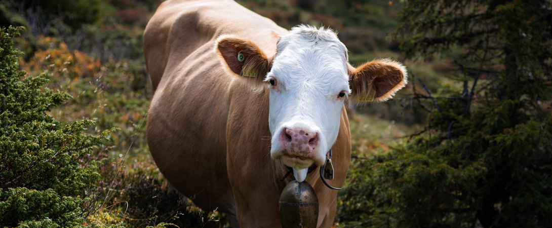
Chickens are by far the most numerously slaughtered land animal, followed by pigs, sheep, and cows. This may seem slightly counterintuitive to the visual representation because the chicken line is the lowest on the chart. However, because chickens are slaughtered in such high numbers, each unit of measurement counts for 1,000 individuals, which is how the UN FAO presents their data as well. If we present the data for small-bodied animals without this adjustment, chickens dominate while all other species lines are proportionally flattened at the bottom of the chart — that’s how stark the difference in numbers is. If we take chickens away, ducks clearly emerge as the second-most commonly slaughtered land animal.
When it comes to land animal slaughter, it’s clear to see that chickens — and to a much lesser extent, ducks — are the most slaughtered species on earth. Going back to the first chart, we can likewise see in the third tab that fish slaughter has been on a steep upward climb for the past 50 years, and that trend shows no signs of slowing down.
It’s worth noting the clear anomaly in the data in the charts above — a significant dip in the number of pigs slaughtered globally in 2019 and 2020, attributable to Asia in particular. There was a significant outbreak of “swine fever” across Asia in 2018/2019, and the resultant culling could serve as an explanation. Though official cull numbers have been difficult to source, news articles such as this one have noted that the outbreak and culling were significant enough to cause global pig meat prices to rise by 40%, and that countries were culling significant percentages of their total herds — Vietnam, for example, culled about 6% of the pigs in the country. Meanwhile, this study estimated that the outbreak and culling resulted in economic losses to China that amounted to 0.78% of that country’s entire GDP, and that any official numbers were likely to be underreported for various reasons. In 2022, pig slaughter resumed an upward trend, which seems to be levelling off since 2023.
In total, the number of land animals slaughtered in 2024 was 87,896,729,120 — an approximately 1.85% increase over 2023. Meanwhile, in 2024, the global population increased by only 0.87%. This means that the growth rate of animal slaughter is continuing to outpace the rate of population growth, as it has in the past — this year by a factor of more than 2. This should be concerning for all animal advocates.
In the chart above, we can see the percentage change year by year for various species, as well as a second tab that shows the bigger picture for land animals, fishes, and the human population. You can toggle different species on and off by clicking the legend below the chart, which may be especially helpful considering some of the data anomalies present for certain species like donkeys.
Looking at the summary tab, we can see relatively clearly that human population growth year to year is declining — in other words, while the global population continues to rise, the overall trend is towards a slower pace. By turning the fish data off, we can even see that the trend in global animal slaughter is towards lower percentage increases. Meanwhile, fish slaughter has shown percentage change above zero for nearly 25 years, and has been growing for the past several years.
In the graph above, we can observe that per capita sheep, chicken, and pig consumption continue to rise, while per capita cow consumption is starting to show a concerning upward trend. Meanwhile, per capita duck consumption is on the rise as well. Per capita fish consumption has also been steadily increasing — though we can see clearly that this is driven by the rise of aquaculture.
It’s worthwhile to deconstruct these time series further to get an idea about where in the world different animal groups are slaughtered the most. To do so, we plot a stacked area graph for the different continents for each animal group. Note that the different animal groups can be accessed by using the dropdown menu at the top of the graph.
The most apparent detail to observe is that, for almost all species, the absolute numbers in almost every continent are trending upwards. The exception is for cows, where slaughter is flat in many continents, rising steadily in Asia and Africa, but declining significantly in Europe. As in past reports, Oceania accounts for a large share of sheep slaughtered worldwide, even though it’s by far the least populated continent. Finally, one positive note is that wild fish slaughter seems to be flat or declining across the world — even in Asia, which has accounted for a high volume of fish slaughter in the past. Unfortunately, this is supplemented by aquaculture production, which shows a steep and steady climb across every continent for the last several decades.
At this point, it’s worthwhile to look at the per capita numbers — and it’s important to note here that for this graph, as well as the ones that follow, we are showing slaughter, not consumption. It may seem odd that certain continents slaughter so many individuals of a particular species, but many of these apparent anomalies are due to the fact that a given country may be a major exporter of a certain animal product.
Looking at the stacked area graph for cows, Oceania remains far ahead in per capita slaughter. Meanwhile, per capita chicken slaughter is rising slightly everywhere, except for Africa where it is essentially flat. Per capita pig slaughter continues to drop in Europe and Oceania. Asia was subject to that significant dip in pig slaughter in 2019–2020, but is trending back upwards — perhaps continuing the upward trend of the past couple of decades, though it’s still too early to tell. For sheep, once again the per capita numbers for Europe, Asia, the Americas, and Africa are overshadowed by those for Oceania, and all continents seem to have a downward trend per capita except for Asia. Meanwhile, per capita duck slaughter is slightly on the rise everywhere, except Africa and the Americas.
Lastly, looking at the stacked area graph for wild fish capture, there seems to be a steady, flat trend. Meanwhile, the chart for aquaculture production, as in other charts, shows a steady and strong climb upwards.
Animal Slaughter Maps
We can further deconstruct these time series by breaking down continents into countries. To depict the distribution of the number of slaughtered animals over the different countries as clearly as possible, we opted to use interactive tree maps.
Looking at any of the species, we can see that a few names dominate these absolute numbers: China — which makes sense based on its size — as well as the United States and Brazil. For certain species, we see more regional differences: India, Indonesia, and Vietnam chart very high in fish slaughter; India, Australia, and Turkey are near the top for sheep slaughter, and the United States, Brazil, and Indonesia are near the top for chicken slaughter. Meanwhile, China dominates in pig slaughter, and Brazil and Argentina are high for cow slaughter.
How do the countries that have a high absolute number of animals slaughtered compare per capita? Below, we use the same type of graph, adjusted for population.
Reflecting a relationship to population, countries like China, Brazil, and the United States tend to drop out of the picture, and indeed, for most species the picture becomes much more diffuse. New Zealand dominates cow slaughter (each year almost one cow is slaughtered per inhabitant). Belarus and Guyana lead in the per capita slaughter of chickens. Denmark slaughters the most pigs per capita (about 2.4 pigs per year per person in the country), while Hungary and China dominate per capita duck slaughter. The per capita map for fishes is dominated by the Faroe Islands, Nauru, Tuvalu, and Iceland.
A disadvantage of using these graphs is that they mainly give a good idea of the “top tail” of country distribution, while the countries with lower slaughter numbers virtually disappear. The interactive world map graphs below provide absolute and per capita representations of the entire globe at once, so that readers can easily find the data for a specific country. You can hover over and click/tap the legend below the map to see which countries fall in a specific range.
Next, we turn to total land animal slaughter by country, both in raw numbers and per capita, adding a higher-level dimension above our species-level totals by country. The visual representation of this data is revealing in a way that species-level data doesn’t always communicate. You can hover over and click/tap the legend below the map to see which countries fall in a specific range.
Unsurprisingly, China, Brazil, and the United States dominate total overall animal slaughter by country. This makes sense, considering population size. Indonesia and India likewise rank highly in total slaughter per country, largely owing to their sheer population size, though it’s not readily visible via heat map. Relatedly, the global heat map somewhat obscures the true scale of some countries’ slaughter — for example, the total number of animals China slaughtered in 2024 is nearly double the number for the United States, the next highest country. Once again, this makes some sense considering their size: the United States’ population is less than a quarter of China’s, so we can simply expect their total slaughter to be lower.
Per capita total slaughter is more revealing. In that view, we see that the picture across the globe is significantly muddier. Notably, China’s dominant position shrinks considerably, Belarus and Guyana are revealed as the highest slaughtering countries per capita by a wide margin, and Australia, Canada, and the United States maintain high positions.
Discussion
As we’ve discussed in past editions, the FAO data is helpful and unique in that it offers a global outlook on the number of animals slaughtered over a longitudinal time frame, and comprehensively across the world. That being said, the data isn’t free from criticism.
We can see very clearly from the totality of the dataset that animal slaughter as an absolute number continues to rise and outpace population growth in a concerning way. This is largely driven by the slaughter of small-bodied animals, especially chickens and ducks, whose per capita slaughter has risen steadily since 1960. The slaughter of other animals has risen and fallen per capita at various times, but the slaughter of those two species consistently drives absolute animal slaughter numbers ever higher.
While this dataset gives us an idea of what is happening in global animal slaughter, it doesn’t tell us why. In other words, we can’t always speculate on why certain animals experienced a drop or rise in slaughter from one year to the next, or why one country dominates over another. Just like we need added context to know why the Faroe Islands is the top country slaughtering fishes per capita — it has a tiny population and a proportionally huge fishing industry — we need to dive deeper and cross-reference this with the other data to understand why certain trends are happening. One recent Faunalytics data analysis project looking at slaughter dynamics and animal welfare laws in the United States found that these questions rarely have simple answers.
In future resources, we hope to use this dataset as a foundation to do continent- and country-specific analyses, combining this with other datasets that may provide more value for advocates. We also hope to expand this analysis to consider additional factors. Others in our movement have offered thoughtful commentary on why focusing strictly on the number of animals killed is not giving us a fulsome picture, and we agree wholeheartedly. In the meantime, we hope that animal advocates can use this data to drive their campaign focus areas in the years to come.
If you have any questions about this resource, please reach out to Faunalytics’ Resource Director, karol orzechowski.
Behind The Project
The Global Animal Slaughter Statistics & Charts is an annually updated resource by Faunalytics, using open access FAO data.
Data are gathered, cleaned, analyzed, and visualized by Faunalytics’ Data Analyst & Visual Coordinator Aro Roseman. The project is overseen and the results are summarized by Faunalytics’ Resource Director karol orzechowski.