Global Chicken Slaughter Statistics And Charts


This post is part of the exclusive Faunalytics series about global animal slaughter. Go here for an overview of the topic and trends by species. For similar statistics and charts for other species, see our posts for cows, pigs, sheep, and goats.
In this post we focus on chickens killed for food. First we consider chickens slaughtered in the year 2016 and then we’ll look at trends over time (1961-2016). As noted in the overview, chickens are the animal that is most frequently killed for food (excluding fish). In total, more than 66 billion chickens were slaughtered for food in 2016 according to United Nations data. For animal advocates, it may be helpful to examine the distribution of these slaughtered chickens.
To get an idea of the current situation, below we provide an interactive global map of chicken slaughter data from 2016, by country. Note that the legend shown is logarithmic to help with interpretation because the differences between countries is substantial. We also provide a table with the ten countries that slaughtered the most chickens in 2016.
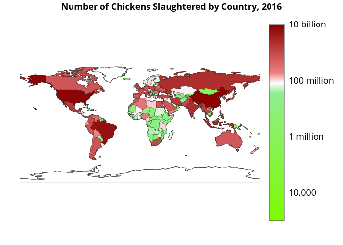
It is evident from looking at the chart and table above that the top ten chicken-slaughtering countries are also countries with large populations. The top three countries (China, Brazil, United States) are the same when it comes to killing chickens and cows for food. For farmed animal advocates, these three countries arguably represent the biggest opportunity to reduce suffering.
To provide some extra insight and control for population size, we also consider the world map for per capita slaughter numbers of chickens. Below we show the same graph and table, but now per capita. Note that the legend of the world map is again logarithmic.
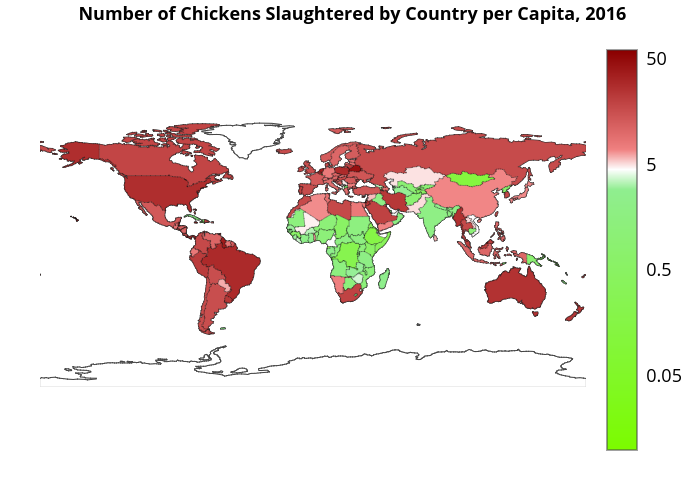
It is remarkable to note that none of the countries that were in the top ten for total number of slaughtered chickens are in the per capita top ten list. The per capita list is made up primarily of small countries, which suggests that the high chicken consumption may be cultural. To give another view of this, we group countries together to see if different regions have different chicken slaughter numbers. Note that we implicitly assume that people from the same continent are somehow culturally “similar” and therefore exhibit similar slaughter behaviour.
Below are stacked area graphs for both the total and the per capita chicken slaughter numbers. In addition to using these charts to test our “cultural hypothesis,” we can also see the trends over time.
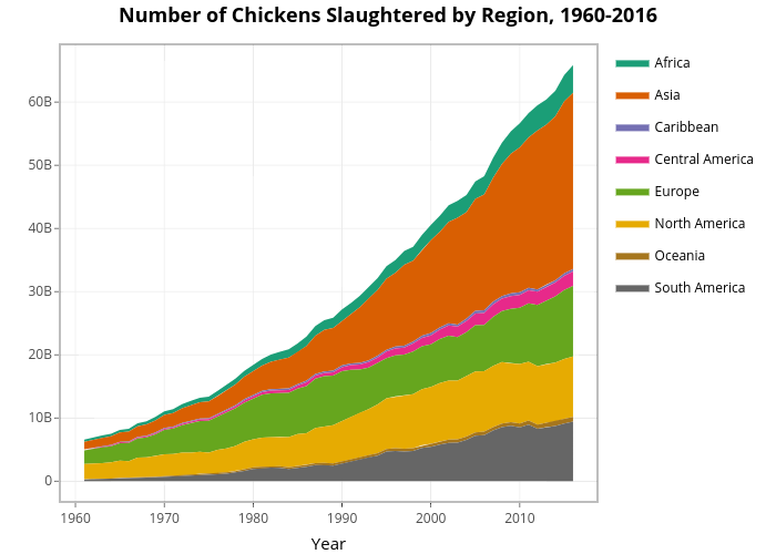
As the chart above shows, the absolute slaughter numbers increase for all continents over time. In 2016, Asia has by far the largest slaughter numbers, followed by Europe, North America, and South America. However, the world population also increased dramatically from 1961 to 2016 and we should control for this. We can do this by examining the per capita stacked area graph.
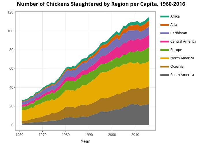
Per capita chicken slaughter also increased for all continents over the period from 1961 to 2016! This underscores the growing popularity of eating chickens, which may be due in part to developing more cost-efficient chicken “production” methods. Throughout the world, there is a lot of work to do for advocates concerning chicken slaughter. We can see that North America is the largest per capita chicken slaughtering region, followed by South America and Oceania.
From this picture we can tentatively conclude that chicken consumption differs in different cultures, as there are clear differences in per capita chicken slaughter between the continents. Animal advocates with limited resources may need to choose between focusing on countries/regions with the largest absolute chicken slaughter numbers or those with the highest per capita consumption. Based on the charts, it may be best for advocates to focus on Asia and North America.
In addition to the stacked area graphs, below we also include a table with the Compound Annual Growth Rate (CAGR) for each region. This is a quick way to compare the trends between the continents. The CAGR is calculated as follows:
$$\text{CAGR} = \left(\frac{\text{Ending Value}}{\text{Beginning value}}\right)^\left(\frac{1}{\text{# of years}}\right) – 1.$$
Performing this calculation for each region results in the following table: